
Culver City Centennial Logo
By ardent desire, City Councilman Jim Clarke is chair of the 2016 Centennial Committee, and the subject was the bare-bones logo, which opened last week, despite fanfare, to modest reviews.
Criticism has centered on the logo’s perceived inartful or art-starved aspects that ignore Culver City’s historic ticket to international attention as the birthplace of motion pictures.
“I have been thinking about this,” Mr. Clarke said. “California is this high-tech place. But if you look at our state flag, it is of a grizzly bear with a line that says ‘California Republic’ and a red star. It’s not very creative, either.”
Responding to observations that the industry most central to Culver City’s history has been snubbed, Mr. Clarke earlier sketched a drawing with movie references, “film cans that looked like the zeroes in one hundred, and a film strip that might look like a one.”
Age knocked the idea out of contention.
“We came to the conclusion most people under the age of 30 have no idea what a film reel looks like,” said Mr. Clarke, “let alone knowing what ‘Heart of Screenland’ (the city’s motto) is about, either.”
The Centennial Committee wanted the logo “to be clearly readable,” he said, “because it could be as small as a lapel pin. We wanted it to be identifiable as Culver City so that people would immediately grasp what it is all about.”
Perhaps no one in Culver City is as avidly committed to making the year-long centennial birthday celebration a spectacular success. In the City Council’s rotation system, he is hoping to be mayor during the centennial.
Using Google, Mr. Clarke studied at least 200 centennial-type logos. “Some were so convoluted, so intricate that they would have been impossible,” he said.
“We thought the one we settled on was clean, expressed Culver City, expressed one hundred.”
He conceded that “it’s not very sexy, though.”
Rebounding fast, Mr. Clarke said, “Yes, but when you look at the logo we chose, you know what it is all about. You don’t have to ask questions.”
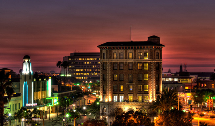
What about featuring the 90-year-old Culver Hotel, the city’s best known architecture, in the logo?
“Then we would have been favoring one business over another,” Mr. Clarke said.